how it looks
Colors, type, motifs, photos, and sloths. The ingredients of the identity.
five color families
Primary family. Headlines, ink, and the deep grounds.
Warm mid tones for covers and accents.
Soft mid tones for cards and quieter surfaces.
The bright accent. Highlights and small moments of light.
Live surfaces. A deep purple ground with butter and lavender.
four roles
NERD
signature ingredients
Soft contour lines, often tucked in a corner. They read on both the deep purple stream ground and a light lavender field.
The diagonal dotted beam from the starting-soon panel. It can sit behind a title or texture a cover.
The O from the offline panel, with a small target inside. It is a letterform detail for big display type on a dark ground.
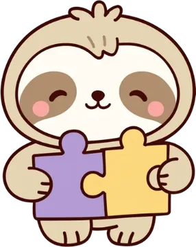
optional characters




a few real frames
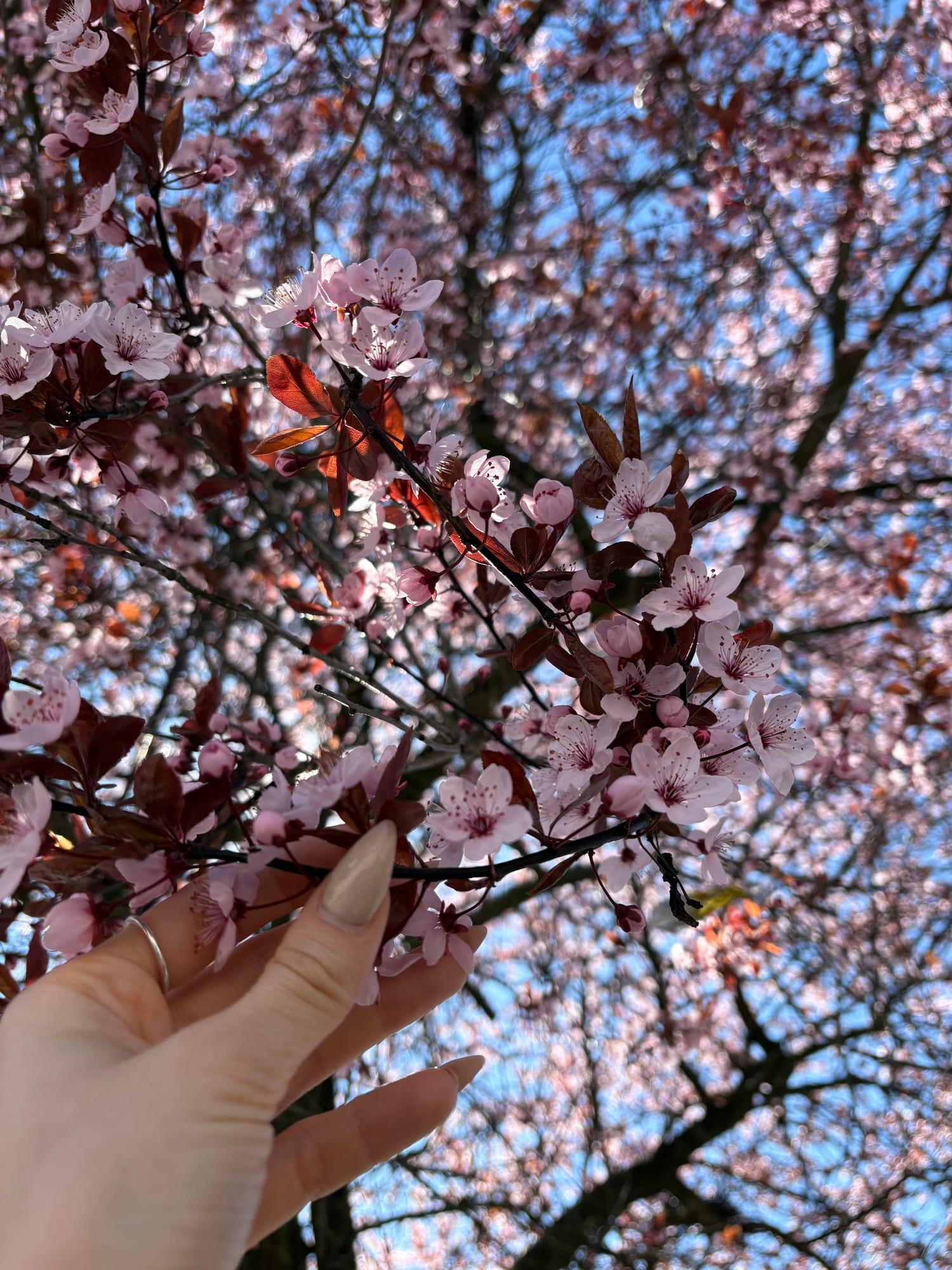
The pastel sky is already the picture. Lifting the shadows is enough; the hue can stay.
A quiet outdoor frame, when the atmosphere matters more than a perfect setup.
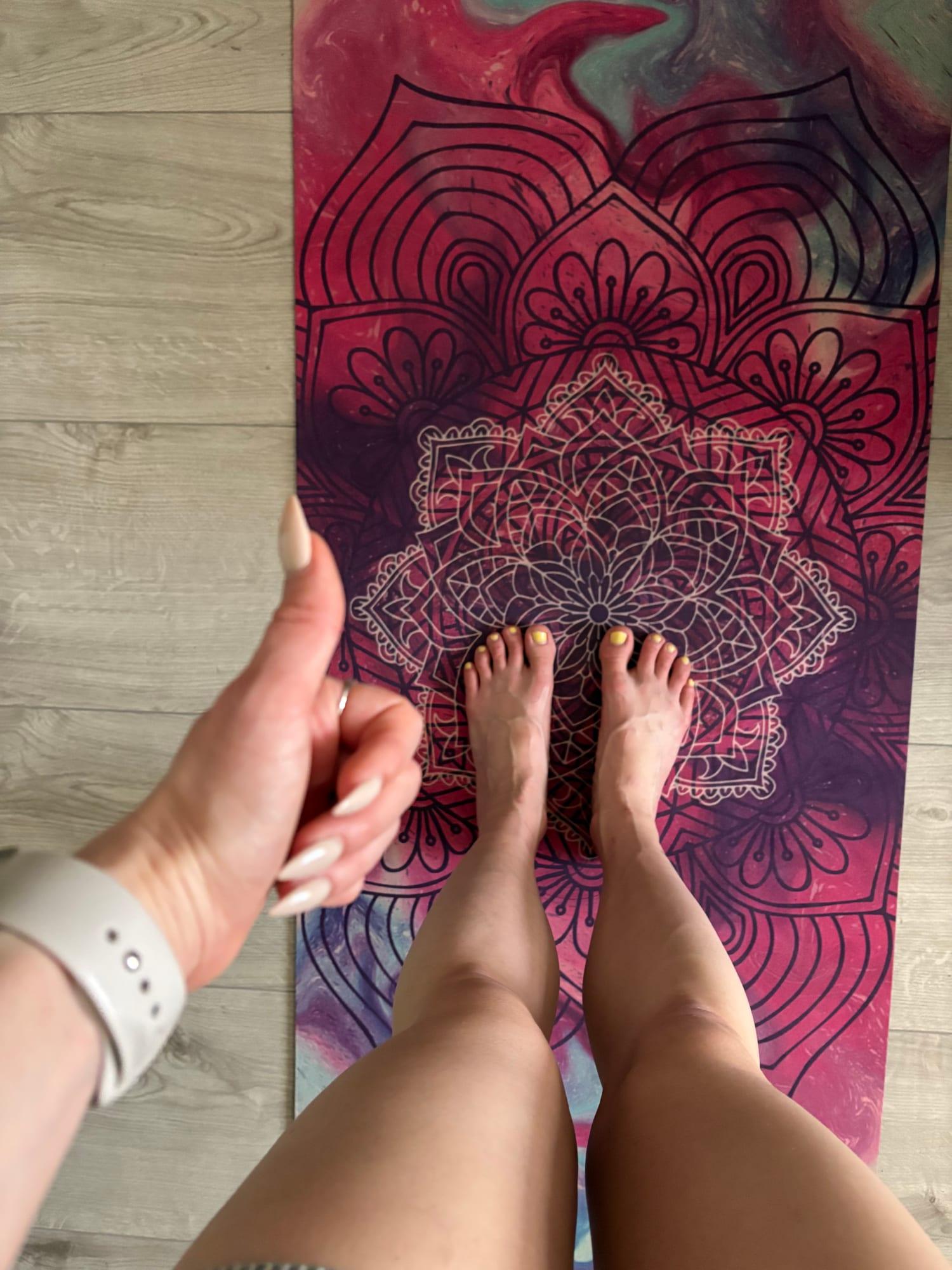
The magenta is already close to the palette, so it can stay vivid while the floor stays quieter.
A movement or self-care detail, shown as a real moment rather than a studio set.
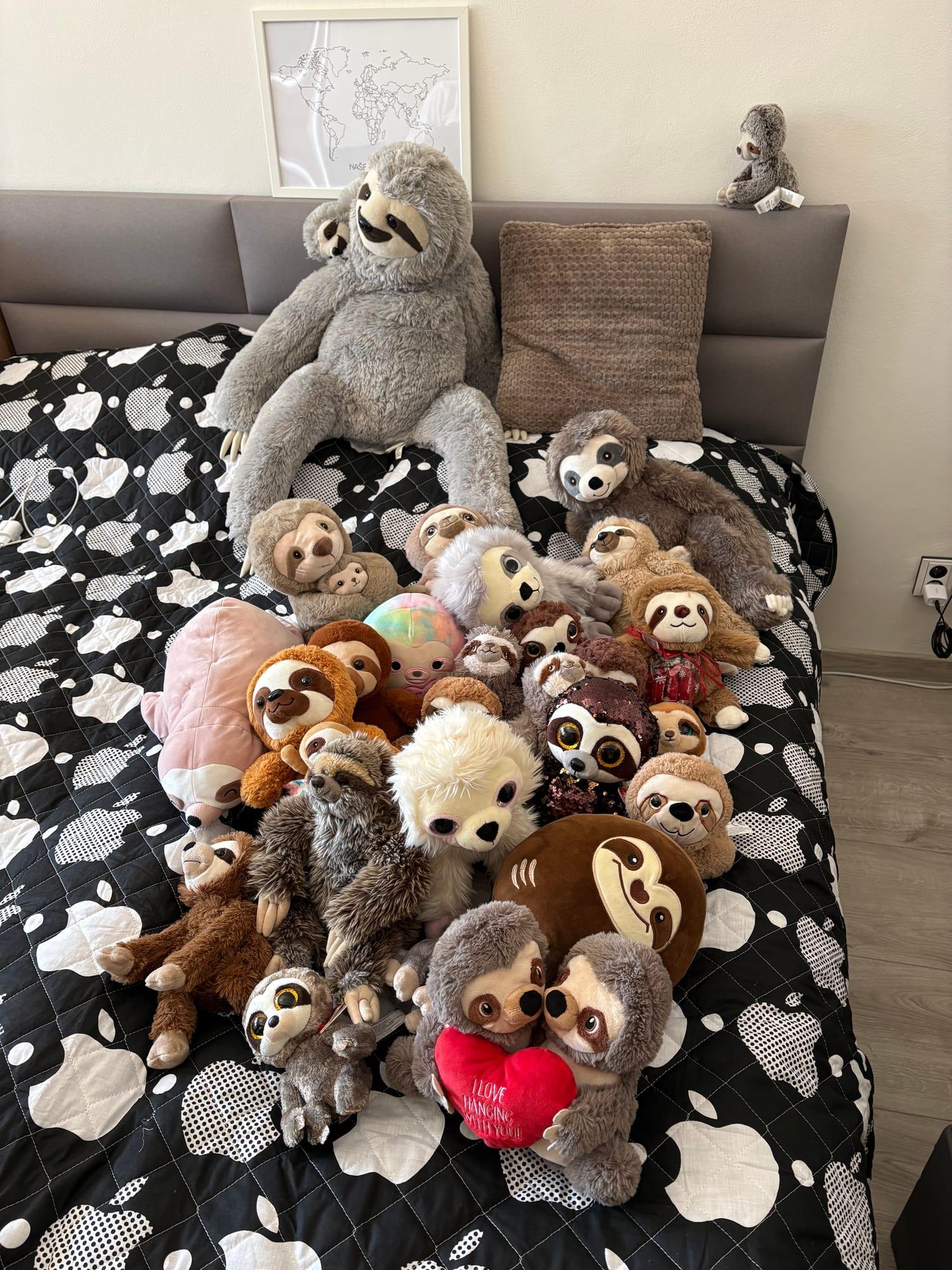
The subject is the collection. A tighter crop keeps a busy background from taking over.
A Play & Nerdy still, especially when the sloths themselves are the story.